Work Delivered
User Research
Art Direction
UI/UX & Design
Results
Reduced opp costs by £5.3M
Designed App E-commerce
2.1 to 4.4 App store rating
Control, comfort and peace of mind for millions of smart home users.
Hive, with over 1 million customers and 2.6 million connected devices, needed a consistent, user-friendly digital experience that worked across all products.
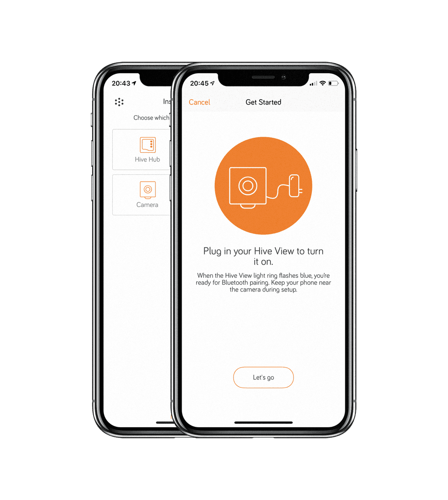
I was brought in to lead the redesign of Hive’s onboarding and device setup experience, launch the outdoor camera and expand e-commerce to the app.
The Hive thermostat was an instant success, quickly positioning Hive as the UK’s largest smart home provider. As it expanded rapidly into new products and markets, the user experience became inconsistent and fragmented.
© Hive Home
Discovery & Research
For Hive customers, onboarding is a critical step. Users either get set up successfully or flood customer support with calls. The existing onboarding experience was inconsistent, confusing, and led to a lot of frustration.
Research Conducted
Ethnographic studies
Observing real users unbox and set up new devices within their homes.
Customer support
Joined agents and listened to live calls and web chats to identify recurring issues.
Internal workshops
Collaborated with engineers and PMs to map existing ideas and technical pain points.

Key Insights
Users struggled with abstract graphics
We needed realistic visual cues that mirrored the hardware in hand.
The setup process was not for 'beginners'
We needed a clear step-by-step guide with less jargon and in-app feedback.
Support calls were high for simple issues
We could reduce the majority of support calls with better UX and in-app guidance.
Design & Prototyping
Based on research, I worked closely with engineers and PMs to design a streamlined onboarding framework that could scale across all devices.
Developed rapid, high-fidelity prototypes to test multiple onboarding flows.
Set up a life-size living room lab to observe users interacting with real devices.
Iterated quickly based on feedback to ensure the experience was intuitive for all users.
Art Direction
To enhance the in-app experience, I collaborated with a 3D render agency to create high-quality visuals that accurately represented device states. These renders helped users understand their devices at a glance and troubleshoot common issues without needing customer support.
Beyond the 3D assets, I worked closely with Hive’s internal Brand team and an external photographer to capture lifestyle imagery. These images featured Hive devices in real homes, showing real people and pets to make the product feel more relatable and intuitive.
App E-Commerce
As Hive expanded, there was a shift from relying on third-party retailers like Amazon to selling directly through the app. I led the design of the in-app store.
Restructuring the information architecture (IA) to make product listings easier to navigate on mobile experiance
Design new product pages for a better mobile experience, ensuring key details were clear.
Created personalised promotions, based on a a matrix of users exisitng or non exisitng products to surface offers relevant to their them
Designed Integrating Apple Pay and delivery tracking, making purchases seamless from checkout to fulfillment.
Control Screens
I created the new control screens for the indoor and outdoor Camera, as well as the colour, temperature, and dimming lights and the Hub 360.
All control screens were rebuilt, and the refreshed design felt familiar while visually aligning with the new brand design system
Designed each control screen to adapt to all screen sizes, including iPhone, iPad, and desktop.


